Archive

Magazines

I have a job interview tomorrow and they asked me to bring a printed portfolio. It’s somehow an unusual request these days, and since I have moved around the world a couple of times recently, I actually don’t have one with me so I usually go to interviews with my laptop and some magazines. That said, I made one. It’s not perfect or anything, it’s a little stiff, the print-service round the corner didn’t have inkjet and some other issues but… I kinda like it!

01

Cardboard, cutter, ruler

02

Using Cosmo to avoid punching holes in the table with my badass IKEA screwdriver

03

Damn! That’s thick!

05

Only the best technology

06

One hour later (that thread!)

1007 08
09

Why do we design stuff? No really, why do we do that?

Well, stuff need to be designed, in the same way food needs to be cooked and roads need to be paved. There is a basic necessity of arranging and ordering things so they can be understood and experienced by other human beings out there.

Problem is that during this process, in between rough materials and finished work, there’s our craftsmanship at work, and inevitably, our ego. This is something I have been thinking a lot about recently. Of course there is nothing wrong in having an ego, everybody has one, and there is nothing wrong in trying to please people. Ultimately, one of the reasons I chose this career is because I really – really! – like it when people tell me “good job Carlo” (there must be some parental issue at play here, relationship with mom & dad and stuff but I don’t want to investigate further).

The fact that we want to be appreciated and relevant can be a very powerful driving force – in a positive way – but it easily distances ourselves from the original purpose of what we are doing. We want to do beautiful design, get compliments and even awards, and we easily forget about the people who are going to pay for what we have done, the public, the readers, who have no interest in who have done what, in why the type is like this or like that, in your grid and so on. They just want to read the damn story.

So, most of the time my work is to try to balance the irresistible tendency to showing off and begging for attention with the ultimate goal of presenting a story in an engaging, readable and enjoyable way.
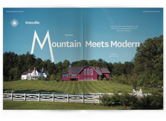
American_Craft_32click to enlarge


A practical example is what recently happened when I was asked to do a story about Knoxville, Tennessee for the good folks of American Craft magazine. I was over the moon reading the headline: “Mountain Meets Modern”. Oh-My-God, I have to do something with all those M’s, what a great opportunity for a luxurious type treatment, maybe three big M’s all across the spread and this and that. I doodled around for hours trying to find a brilliant solution, something that would get me a big applause or at least a couple of retweets. I was – again! – in designer mode. Designing design for designers. I can’t imagine anything more boring and useless.

The only way out here is to get back to the story, the only thing that really matters. I scaled down my ego a bit, I reduced type size to a more approachable level, and placed the headline in a way that was respectful of the picture chosen for the opening and that could actually be read by people. So (1) first is the picture, (2) second comes the headline which has to be readable and comfortable, and then, just then, (3) I put my twist in it. This sequence is very important and it’s exactly the opposite of what I was doing before. Once everything was set, I could throw a Futura M in the mix, just because it looks like mountains and then place chunks of text as peaks here and there, so that everything is balanced but not too much. I know, it’s not that Jantschicholdish (which, btw, I deeply love) but I can have some fun, right?

So what I am trying to say is that ultimately we design for the people out there and not for ourselves, and this is very important. When we design we’re just arranging things so people can access them. Our job is humble, more a service, behind the scenes, invisible, and one of the greatest accomplishments for a designer is to trigger a little smile and/or some (visual) pleasure without interfering in the reading experience. It’s simple, but not easy.

el·e·gance
/ˈeləgəns/
noun
1. the quality of being graceful and stylish in appearance or manner; style.
“a slender woman with grace and elegance”
2. the quality of being pleasingly ingenious and simple; neatness.
“the simplicity and elegance of the solution”

Elegance VS Style

Use of the words “elegance” and “style” over last two centuries in english books archived in Google Books (click to enlarge)

So not only there is an overlapping of meaning  between the nouns elegance and style, but data say that elegance is progressively going out of fashion, subbed by the more generic and appealing almost-synonim.

Still, especially in (magazine) design, style and elegance are two extremely different ideas, almost opposite.

Achieving elegant results requires expertise, refinement and, usually, a lot of time. To be stylish you need a good knowledge of what is hot at the moment and great tech skills to reproduce it. Neither of the two is an easy job, but apparently elegant designs – by definition pleasingly ingenious and simple – tend to be long-lasting and some of them become timeless. Which, I think, is what we all should aim at.

I am very excited for being part of My Favo(u)rite Magazine project and now that the real thing has shown up in my mailbox I can finally write something about it.

It is an actual magazine (just one issue, 180x240mm, 64 pages) conceived by Huffington Post editor Andrew Losowsky and Magculture.com editor Jeremy Leslie in order to rise funds for helping legendary creative director Bob Newman (New York magazine, Village Voice, Real Simple, Newmanology…) after an accident that left him in a coma for two weeks, with a long path to recovery ahead of him. He and his  family now faces enormous medical bills so all proceeds from My Favo(u)rite Magazine will go to them.

You can find also my contribution among some really extraordinary professionals of the magazine and media industry such as Richard Turley (Bloomberg Businessweek), Marissa Bourke (Harper’s Bazaar), Rudy VanderLans (Emigré)  and many others. I am so proud and honored!

It is  a beautiful publication, with tons of interesting and inspiring thoughts from a wide range of designers (actually, 88 of them!).

If you wanna grab one and help Bob in his recovery just follow this link. A digital edition is available too.

photo 1 photo 2 photo 3 photo 4

Pictures shot with my iPad @ Urban Bean Coffee in Minneapolis, USA.

I am always happy when I find in my mailbox a big envelope from overseas, meaning that some independent magazine or book has made the transatlantic voyage to my little studio apartment in Minneapolis, Minnesota.

I was super excited to have finally issue #2 of Wearehere, an independent travel magazine edited by Conor Purcell, editor of Emirates’ Airlines Open Skies.

Wearehere #2 had an adventurous development. Being all about Dubai, it suffered of a particularly annoying form of censorship: advertisers retired their contributions because of pressure of local government authorities.

Instead of watering down its content and obey to Dubai government requests, Wearehere crowd-funded the entire issue (which is, in fact, ad-free) and went on press late but without censorship.

All the photos in the magazine have an instagrammish flavor, paper is thick and matte, stories are always intriguing and unexpected.

I am really proud of my little contribution and I strongly reccomend you to buy a copy and follow these guys here and on Twitter.

photo 1

photo 2